i like your new layout for labs. it’s nice, especially dark mode, however i c’ant see the content of tasks ie. the contrast between the font and the background is so small that is hard to read. am i the only person who reported it?
Hi @Bartek-B,
Thanks for the feedback. Can you please share the screenshot for reference? I’ll forward this to the concerned team. They’ll look into that.
Regards,

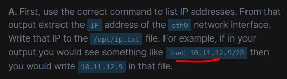
Could be a little bit more contrast, isnt it?
and in the past it was enough to double-click on the selected text and everything would be selected, but now you have to select it manually
Thanks for sharing the image, @Bartek-B. I have forwarded your feedback to the team.
I’ll reach out to you again if the team requires more details.
Regards,
it’s not something that prevents you from working, but maybe it can be improved?
Thank You
regards
Yes, I appreciate your input, and rest assured, our team is committed to continuous improvement.
Please feel free to share more feedback with me.
Regards,